Visited the Paul Graham exhibition at the Whitechapel Gallery today – my second visit, which allowed me to think about why I liked the photographs I picked out the first time.
The set Troubled Land are, at first glance, not particularly interesting – fairly banal landscape shots – but then you notice the key details: the British flag, the soldier running across the roundabout, the Republican procession. You have to search out these details – they are not placed in the composition in such a way that your eye immediately fixes on them, and they are tiny details in the context of the overall frame. In the case of the procession, even when you do notice it (and it is positioned where two diagonals meet) you have to read the caption to know what it is. You can tell yourself that everything is normal – the significance is in knowing that it's not, and what those symbols mean.
The first time I saw A1 – The Great North Road they reminded me strongly of Martin Parr, but the second time I felt that they were a much more affectionate set of photographers than that would imply – particularly the portraits. He frames the subjects with great sensitivity, using the architecture - however mundane – in a way that gives them dignity. The colours are more subdued, not as harsh or gaudy, and the light is much softer than Martin Parr's. Another thing I like about this set of photographs is the way that Graham using line – the strong diagonals in photographs such as 'Lorry Driver', 'Interior, Blyth Services', 'Bible, Driver's Bedroom' and 'Interior, Rainton Services' give the images an energy which belies the subject matter.
Saturday, 18 June 2011
Tuesday, 31 May 2011
Exercise: rhythms and patterns


Monday, 30 May 2011


Thursday, 5 May 2011
Exercise: curves
 In this photograph, the shape of the bridge and its reflection creates a strong curve which forms a frame for the scene of the sunlit boat house.
The curved structure in this image leads the eye into the frame towards the odd leg on a stool.
The bend in the river echoes the direction in which the boats are travelling, and emphasises the movement.
In this image, the curved wall and the curved shadows on the floor lead the eye round to the two figures leaning against the wall.

In this image, the curved wall and the curved shadows on the floor lead the eye round to the two figures leaning against the wall.
Wednesday, 4 May 2011
Exercise: Multiple points
Set up a still life using between 6 to 10 compact objects to examine the relationship between the points.


For this exercise I've used a selection of buttons; trying to arrange them in a fashion which did not look obviously contrived. It was surprisingly difficult, especially because at the beginning, when there were only a small number of objects, it was impossible not to see implied lines between them forming clear shapes. It was only when there were more than about six or seven objects that it became possible to overlook the lines. Even so, at the end, I could link all the objects on display to all the others through lines or shapes.


For this exercise I've used a selection of buttons; trying to arrange them in a fashion which did not look obviously contrived. It was surprisingly difficult, especially because at the beginning, when there were only a small number of objects, it was impossible not to see implied lines between them forming clear shapes. It was only when there were more than about six or seven objects that it became possible to overlook the lines. Even so, at the end, I could link all the objects on display to all the others through lines or shapes.
Tuesday, 26 April 2011
Exercise: the relationship between points

In this photograph, the duck is the most prominent object - it is bigger, more centrally positioned, and they eye seems to be drawn to it from the other object.
 The red object seems the most prominent in this photograph; although the green is larger, the eye tends to 'read' from it to the red object.
Monday, 18 April 2011
Exercise: diagonals
 This photograph illustrates how diagonals will form from parallel lines going off into the distance towards a vashining point. The train, the platform, the benches and the rails all created strong diagonal lines.
 This photograph was taken behind the finishing line of the Brighton marathon. I wanted to show the long line of trucks which had been used to transport the belongings of the runners from the start line. The way they recede into the distance is designed to emphasise the sheer scale of the operation.
In this shot the diagonals in the sky create a sense of drama.

This shot was taken just before the finishing line. I've used the road markings and the railings to create diagonals, which link the runner on the left to the strether on the right, both clearly travelling in the same direction.
Sunday, 17 April 2011
Exercise: horizontal and vertical lines
 The lines in this photograph were created by using a telephoto lens, and taking a viewpoint more or less at eye-level with the flowers. The distance between the rows of flowers has been suppressed in this image, so that the rows look like horizontal lines.
 This photograph again uses a telephoto lens to reduce the impression of distance between the rails of the bicycle rack, and to emphasise the horizontal lines.
This photograph shows a row of posters attached in a horizontal row along some railings. The line of the posters is reflected in the line of shrubs and the top of the wall at the bottom of the frame.
 This image shows a display of cakes on a market stall. The cakes have been arranged in steps which are rendered as lines in the two dimensions of a photograph; the stripe of the red background, and the clothes laid out along the tops of the cake boxes emphasise the horizontal lines.
The vertical lines in this picture were achieved by using a wide aperture and leaning against the wall to focus on the black iron drain pipe. The image was cropped so that the white wall and green door also look like vertical stripes.
 This is a photograph of some metal railings; I've gone in quite close to obscure the objects (a bicyle and boat) behind them, and made sure that the outside rails line up with the edge of the frame to emphasise the vertical lines.
 I stood on a bridge overlooking the river to take this photograph, which has rendered the punt and particularly the punt pole as vertical lines in the frame.
 For this photograph again I've used a telephoto lens to place the black line (which is a hand rail) against the wall; I would have preferred to have the line a little further towards the centre of the frame, to really draw attention to it.
Monday, 11 April 2011
Exercise: positioning a point
I found the instructions for this exercise rather confusing – it was not clear to me whether the images selected should illustrate a single point positioned on a background which contained no other detail (a plane in a clear blue sky, for example, or a lone car in an empty and unmarked car park) or whether other features were allowed (as in the examples given in the book). I've opted for the latter approach for one of these, ensuring however that the other features in the images would not be considered a single points; for the two other images there is a single point against a (relatively) plain background.

This first photograph shows a couple walking together on the beach at Brighton. I've placed them in a spot which balances them with the pier in the background – the idea being that the harmony and balance in the composition will suggest harmony and balance in the relationship between the couple.
In this photograph I've positioned a single point – a padlock – right in the centre of the frame. I wanted to suggest lack of movement – emphasising that the padlock is an uncompromising obstacle.

Finally, a photograph of what passes as graffiti in Cambridge. I've placed this in what I perceive to be a slightly unconventional position in the frame – the idea is that it's a puzzle, something unexpected.

Sunday, 10 April 2011
Exercise: A sequence of composition
It took several goes to get a sequence together for this exercise; I tried a group of street performance dancing outside a shop in Cambridge, and a group of people punting on the river - neither of which generated a satisfactory final image. This weekend I was in Brighton, and decided to have a go at getting a picture from the Brighton Marathon, which was being run this morning.


The route along the seafront (towards the finishing line) was heaving with people, and I had a couple of false starts trying to capture the sense of excitement and activity about the place - from the roadside it was difficult to take any pictures without unwanted limbs and heads getting in the way of my preferred composition. Eventually however I found an elevated spot about four hundred metres from the finish, from where I could see the runners on the road, the promenade lined with people, the beach and finally a strip of sea. On the beach was a café, with a very prominent sign advertising fish and chips, and I decided I'd like a picture of the runners passing this sign.
This was the first picture I took – just to set the scene for myself really, and to see what I could get into the frame:
f/16, 1/125s, focal length 50.00mm
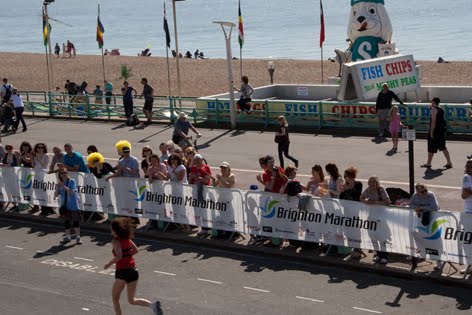
I reviewed the image files on the camera as I took them so that I could arrive at the picture I wanted consciously, rather than through serendipity. From looking at this first image I could see straight away that I wasn't going to get the picture I wanted in a landscape format: the shape was wrong as to get both runners and the sign into the picture the sign had to be top right and the runners already passed it (out of the way of temptation) in the bottom left corner. From then on I shot the photographs in portrait format.
f/16, 1/100s, focal length 50.00mm

This shot has too much foreground in it, and the central position of the café sign still doesn't allow room to show the relationship I wanted to suggest between the runner and the sign. After this one I positioned the sign in the top left corner, and waited for a runner to take up a bit more room in the foreground. I kept the camera to my eye for several shots, relying on the cheering from the crowd to alert me to when a runner was about to enter the shot. The next few shots were therefore not reviewed immediately. (The following are examples from about 20 shots): 


When I reviewed these shots I realised that runners in white shirts weren't standing out sufficiently against the white marathon banner. I took a few more, therefore, and focussed on runners in coloured shirts. When I reviewed the final images on the computer screen, I decided that this one was composed more or less as I wanted: 

I like the way the runner is linked to the café sign through a diagonal line of spectators and promenaders. I cropped the image to remove some of the foreground and straightened the horizon. I also increased saturation slightly so that the colours in the sign would stand out more on the final image.

Thursday, 7 April 2011
Format Festival, Derby
Last weekend I spend a day in Derby to see some of the work on show as part of the Format Festival 'Right Here, Right Now'. It was great to have the opportunity to see so much and such a wide variety of work, though I was quite surprised at how consistent my own reactions were to what I liked and disliked. It will be interesting to see if my views change as this course continues.
I started with a browse round the displays outside the Quad in the Market Place, and really fell in love with Constantine Manos's photographs of Daytona Beach. I love the use of colour in the composition of these photographs – for all they fulfil the remit of 'street photography' there was nothing casual or momentary about them. They all struck me as very balanced, and having a serenity and solemnity I was really expecting to find. And in fact, one of the things that struck me most about the visit that amongst all the photographs I saw, those that stuck with me were not the candid action shots of street life I'd expected to see, but those that had been composed with seemingly as much care as a still life or landscape.
In the Quad I spend a long time in front of the Baltic Street Photography slideshow (as you had to if you wanted to see it all...) I was struck by the contrast between Alexander Gronsky's Pastoral and Alnis Stakle's work. In Gronsky's photographs of people in the undeveloped wasteland around Moscow the urban development in the background seemed to tower over the tiny figures in the foreground like their overlord – something out of the War of the Worlds. The humans looked puny and insignificant in comparison, scratching around in the dust. In Stakle's work, on the other hand, the urban development frames the activity of the people – they interact with it, which they don't appear to in Gronsky's.
George Geogiou, too, lets the viewer see figures in the context of the landscape. I overheard a young girl talking to her mother about Hakkari, Eastern Turkey and she was fascinated by what he was doing up on the roof of the building, engaged in the domestic act of washing down the roof while dressed in his smart suit. With the backdrop of the city behind him I thought the composition has an epic quality – the figure looked magnificent in that setting.
I was very much looking forward to seeing Bruno Quinquet's Salaryman Projects, and in the event I was slightly disappointed that there weren't more photographs on display. I got a real feeling of tranquillity flicking through the images on my laptop; in the gallery there were barely enough to get a sense of what the project is. But I still recognised the cleanness and balance in the compositions, and how this appears to give the anonymous subjects a significant degree of dignity.
Finally in the Quad I found myself surprisingly moved by WassinkLundgren's Empty Bottles. Possibly because all the people in the photographs are engaged in the same act there is an element of ritual about them. The frames are usually uncluttered (possibly because WassinkLundgren's approach gave them the opportunity to plan elements of the composition in advance), and, again, this gives them a degree of dignity despite the fact of the act they are engaged in.
Having now established to my own satisfaction that the works I liked most were those that gave the subjects dignity and respect (or at least drew attention to the lack of it in a manner which seemed sympathetic) I was not surprised by my strong reactions to other approaches I saw on display – Peter Dench, for example, whose works struck me as very judgemental of their subjects, or Bruce Gilden's street portraits at the Museum of Derby; in the BJP video accompanying the latter I noticed the statement that Gilden had been given 'carte blanche' to shoot on the streets of Derby, and thought what an easy thing that was for the BJP to grant, given that he wasn't confronting them with his camera. Maybe it's just that I wouldn't be comfortable taking that kind of photograph myself – I definitely would not want to come across as a hunter, to use Bruce Gilden's simile.
The last exhibition I saw was In-Public, and I really enjoyed the humour in a lot of the pictures. David Gibson's photograph of the guy with an umbrella and the painted cloud on the hoardings behind him, Matt Stuart's Oxford Street, Nils Jorgensen's one-man-band and Paul Russel's photograph of two woman on the street in Bristol (with the cursory attempt at beautification on the hoardings behing them) – those all struck me as being about timing, reactions and having an eye for the potential in a subject. There were also a couple of shots which hinted at intriguing narratives: Richard Bram, Cold Night, Soho, London and especially David Solomon's photograph of two people in the window of a cafe, the oblivious boyfriend reading while the girlfriend looking wistfully out of the window, echoing the gaze of the lone man outside.
Tuesday, 5 April 2011
Exercise: Fitting the frame to the subject
Experiment with how much space the subject takes up in the frame of the viewfinder The subject of these photographs is one of the stone lions on the steps of the main entrance to the Fitzwilliam Museum, Cambridge. The first picture is the standard shot, with no real thought to composition: f/14, 1/125s, focal length 43.00mm: 

The second shot gets in close to the subject, and fills the frame (or most of it): f/14, 1/100s, focal length 80.00mm

The third shot is a detail, also filling the frame: f/16, 1/100s, focal length 147.00mm

And finally, a shot in which the subject occupies only a small part of the frame, and in which the surroundings are emphasised: f/16, 1/100s, focal length 18.00mm:

Lessons Learnt: Part 1 and Assignment 1
Having completed Part 1 (bar writing up a few of the exercises) and Assignment 1, I thought I’d summarise what I feel I’ve learnt so far. The most interesting thing (something I should have known anywhere no doubt) is the effect on the subject of choosing wide-angle or telephoto. I’ve always thought that you use a wide-angle lens to take photos of something close to you, and the telephoto if the subject is far away. I’ve never noticed what a difference the two extremes make on how the picture of the subject turns out – the flattening effect of the telephoto (which I used for Assignment 1 to convey the effect I wanted for ‘straight’), and how much better colour, shape and depth of field are preserved with the wide angle.
I’ve also realised that I have to get used to using the tripod more, especially if I am using the telephoto lens. A couple of the images for Assignment 1 (‘Still’ and ‘Moving’) required relatively long exposure times – much longer than can reasonably be accommodated by hand-holding the camera, and ‘Still’ especially would have benefited from being much sharper.
Another thing that’s struck me is that, whatever the subject, there are only so many things you can do with the camera, and the trick (or skill) is to make sure that you’re using them in the right combination – shutter speed, aperture, focal length, format, decisions about what you leave in, what you leave out, where you position the objects in the frame, and so on. My problem at the moment is that I want to try every combination and wait until afterwards to see what works best, which is quite time consuming. Eventually I hope that I’ll have more of a sense of what combination of elements is going to convey what I’m trying to convey when I start.
For future assignments (and exercises) I shall do a lot more planning. I still have a tendency to hope that, as long as I’ve set aside some time to go out with the camera, and as long as I know what the exercise is, I’ll find a subject somewhere along the way. That hasn’t often worked. Much more successful have been the trips when I’ve known where I’m going and what I’m going to do when I get there. I’ve already started making more notes of potential subjects when I’m out without the camera. It means more reading ahead of the course material so that I know what’s coming up and have an opportunity to plan.
Tuesday, 15 February 2011
Exercise: Focal lengths
Take a sequence of photographs, all aimed in the same direction, at different focal lengths.
These photographs were taken in Hyde Park of a sculpture by Anish Kapoor. It was a miserable, wet, dull day - quite dark, despite being only one o'clock in the afternoon.
 Focal length 18.0mm, f/3.5, shutter speed 1/125s.
In this photograph the foreground is emphasised, the line of trees shows the depth in the scene and leads the eye down to the sculpture. The tree line in the background is quite thin - it highlights the sculpture.
 Focal length 63.0mm, f/5.0, shutter speed 1/125s
As the focal length increases it seems natural to move the horizon further up the picture to create some depth. The perspective in the line of trees on the right has become quite compressed.
 Focal length 250.0mm, f/6.3, shutter speed 1/125s.
At this length the different elements in the landscape - the foreground, the lake, the trees in the background, have become almost like flat strips - almost abstract. There is very little impression of depth compared with the same scene shot at 18.0mm.
Subscribe to:
Posts (Atom)